Hopefully, you've recently finished building yourself a complete page in HTML. “But wait,” you say. “This isn't what real websites look like. This is what garbage websites look like!”
Even if your HTML looks perfect, it's not enough on its own. Thankfully, we have CSS: a tool to help our websites not look like garbage.
What is CSS? What does it look like?
CSS modifies properties of HTML elements. Here's what it looks like:
p {
    font-size: 20px;
}
That snippet of CSS will set the font size of all paragraphs on an HTML page to 20 pixels.
More generally, a CSS rule is formatted like this:
[selector] {
    [property]: [value];
    [property]: [value];
    [any arbitrary number of property/value pairs]
}
CSS has a strange learning curve, because almost none of the knowledge is conceptual; instead, learning CSS comes down to getting familiar with a lot of different properties one at a time, and trying a lot of different solutions when problems come up. Once again, Google will be your friend!
In order to write CSS, we have to get familiar with selectors: the strings that determine which elements your CSS rules are applied to.
[selector] {
    [property/value pairs]
}
Selectors
There are a couple different ways we can specify HTML elements using selectors. Let's dive in!
Element type
In the first example on this page, the selector was just one character long: p. That selector means that the CSS rule applies to all <p>'s on the page.
We can do the same thing with any HTML element: a, h1, body, you name it. However, it's important to note that many CSS rules will apply not only to the selected elements, but also to their children. For example, check out the following rule:
body {
    color: red; /* the "color" rule sets text color */
}
This will make all of your website's text red, because all of the page's content is nested inside the body.
Classes
What if you wanted a CSS rule to only apply to certain paragraphs? That's what classes are for! Check out this snippet of HTML and CSS:
<body>
    <p>This is a normal paragraph.</p>
    <p class="special">This paragraph is special, mmkay?</p>
</body>
p {
color: red;
}
.special {
font-size: 36px;
}A class is just another attribute of HTML elements. In order to use a class as a CSS selector, all you need to do is add a . to the beginning of the class name in your CSS.
In the example above, both paragraphs will be red, because the color: red rule applies to every <p> element. But only the second paragraph will have a larger-than-normal font-size.
You can apply any class to as many HTML elements as you want. Let's look at another example:
<body>
    <p>I'm a normal paragraph.</p>
    <p class="small">I am so small.</p>
    <p class="small">I am so small.</p>
    <p class="small">I am so small.</p>
</body>
p {
color: red;
}
.small {
color: blue;
font-size: 8px;
}Only the first paragraph will have a normal font-size; the last three will be super small.
But what about their color? The last three paragraphs have two different rules that affect their color: all <p>'s have color: red, but all elements with the small class have color: blue. Will this break something?
Nope—the last three paragraphs are all blue! CSS is smarter than you might think, and it knows that the .small rule is more specific than the rule that applies to all paragraphs. Therefore, if there are any conflicts for a specific HTML element, CSS follows the most specific rule that applies to it.
Combining selectors
What if you wanted a rule to apply to multiple selectors? CSS makes that easy, too!
<body>
    <h1>Pokemon are sick</h1>
    <p class="big-red">Charizard</p>
    <p class="big-blue">Blastoise</p>
    <p class="big-green">Venusaur</p>
    <p>Fuck Digimon amirite</p>
</body>
.big-red {
color: red;
}
.big-blue {
color: blue;
}
.big-green {
color: green;
}
h1, .big-red, .big-blue, .big-green {
font-size: 72px;
}You can use commas to combine selectors (both HTML element selectors like h1 and class selectors like big-red). In this example, everything except the last paragraph has a font-size of 72px.
Now, we're ready to talk about the different kinds of properties you can set using CSS! There is a truly enormous number of them, so let's focus on three different categories: text, colors, and positioning.
How can I customize text with CSS?
Typography can be one of the most fun parts of building a website, if you are a nerd like me. Let's go through some relevant CSS properties to help make your text look excellent!
font-size
Sets the size of the text. There are several valid units for properties like this, but let's stick to px, because it's consistent and easy to use.
font-size: 10px;
font-size: 18px;
font-size: 32px;
Generally, the most readable size for text is around 18 or 20 px, but it will depend on the font and the context. Note that a little change goes a long way when it comes to pixels!
line-height
This attribute will control the line-height of your text. Again, we'll use px as units. To help show this visually, I've changed the background-color of these next paragraphs, which we'll talk about soon!
line-height: 15px;
You don't want your line-height to be less than your font-size. Readability should always be your priority.
line-height: 20px;
If your line-height is the same value as your font-size, it still might look cramped.
line-height: 40px;
Because double-spacing isn't just for making your essays hit ten pages! This can look awkward, too, though, so be careful.
Some people believe that the ideal line-height is (font-size × 1.618), which is the golden ratio. It does work remarkarbly well, and it's how the text has been set for this tutorial all along.
font-weight
Font-weight can be a finicky attribute, because it depends on the font you're using. The two most common values are 400 and 700 (no units), which translate to "normal" and "bold". The font I'm using, Lato, also has a 900 weight, which I use for my h1's.
font-weight: 400;
font-weight: 700;
font-weight: 900;
font-style
Font-style should be used as nothing more than an on/off switch for italics. Relevant values are italic and normal.
font-style: italic;
font-style: normal (default value);
font-family
Font-family might be the most important attribute, because it lets use choose our actual font! There are several built-in fonts that will work in any browser (of which Times New Roman is the most infamous), but we can do better than that.
font-family: Times New Roman
font-family: Helvetica
font-family: Lato
Lato isn't a built-in font, but I can use it thanks to Google Fonts. Google Fonts gives you free access to thousands of different fonts, and it's extremely useful. It's easy to use: once you select a font and some weights, all you have to do is insert an HTML snippet—which they provide for you—into your website's head! Here's the one I use for this website:
<link href='https://fonts.googleapis.com/css?family=Lato:400,700,900,400italic' rel='stylesheet' type='text/css'>That snippet of HTML is all I need to use Lato at different weights.
Now that we have some typesetting skills, let's take a look at colors! Nothing in life is black and white, so your website shouldn't be either.
How do colors work in CSS?
While it's possible to make a paragraph red using color: red, you will quickly find that that won't offer you a whole lot of creativity. CSS allows you to be much more specific than that!
RGB
There are several options for syntax, but a good alternative is RGB, where you specify a value between 0 and 255 for red, green, and blue.
color: rgb(0, 0, 0);
color: rgb(0, 0, 255);
color: rgb(42, 136, 252);
Remember: rgb(0, 0, 0) is black and rgb(255, 255, 255) is white.
Hex
You should also be familiar with hexadecimal notation, or more simply, hex values (or hex codes). Here's what it looks like:
color: #000000;
color: #0000FF;
color: #2A88FC;
Hex codes work the same way as RGB, where red, green, and blue each get a value from 0 to 255. However, hex uses just two characters for each: they're numbers in base 16. The second example above, #0000FF, translates to rgb(0, 0, 255). The first two numbers, 00, translate to a red value of 0; the second two numbers, 00, translate to a green value of 0; and the final two numbers, FF, translate to a blue value of 255.
In context
Let's look at some examples of using colors in context.
Setting text color
We've done this before! You can set text color just by using the
colorattribute..white-text { color: rgb(255, 255, 255); }Setting a background color
Every element has a default background color of white, but it's easy to change. You can change the background of your whole website just by changing the
background-colorof the body.body { /* This will make your whole website neon green */ /* Not a great idea */ background-color: rgb(0, 255, 0); }
A note about font color: black isn't always the best option on a white background, nor is white always the best option on a dark background. Using a light or dark gray will help soften any harsh contrast. The text you're reading now is actually a dark gray, #222222.
We have one more topic of CSS attributes to cover: positioning. Positioning things using CSS can be frustrating, but you'll learn quickly! And by that I mean you'll quickly learn that CSS is completely unusable and broken forever. Welcome to the party.
How do I position elements on a page?
CSS gives us many tools to solve the problem of placing something on a page. Often, there are multiple solutions to the same problem.
Position
Position is an important CSS attribute to understand. It only has a few possible values, but they are all very powerful. Let's look at the most relevant ones:
-
position: fixedThis is the easiest position to work with. A fixed element stays in the same visual spot on your browser no matter what. Notice how the hamburger menu on the top left stays in the same place no matter where you're scrolling. That element is
position: fixed!To use this, you also need to specify one or more of the following attributes:
top,bottom,left,right. Here's an example of a button that will stay in the bottom right of the page:.button { position: fixed; /* the bottom of the button will always be 20px from the bottom of the window */ bottom: 20px; /* the right edge of the button will always be 20px from the right side of the window */ right: 20px; } -
position: absoluteThis works a lot like
position: fixed, except that instead of fixing an element to the window, it fixes an element to its parent, as long as the parent isposition: relative. Once again, you'll generally need to also specify one or more oftop,bottom,left, orright. -
position: relativeRelatively positioned elements generally behave as you'd expect them to. When you specify any position on a relatively-positioned element (
left,right, etc.), everything else is positioned by ignoring the changes to the relatively-positioned element. In other words,position: relativeis a good way to change the position of only one element.
Position is a difficult attribute to visualize. I'd recommend checking out the CSS-Tricks and MDN articles on position to get a better picture. In general, CSS-Tricks and MDN are excellent references for anything CSS-related. I always learn something when I read an article from them.
Width and Height
You can specify both the width and height of HTML elements using these attributes. Use either px or % as units. When using %, bear in mind that the percentage is computed as the percentage of the parent element's width or height.
<body>
    <div class="container">
        <p class="text">I am so tall</p>
    </div>
</body>
.container {
height: 800px;
}
.text {
/* ends up being 800px, because its parent's height is 800px */
height: 100%;
}Text-Align
This rule aligns text, like Microsoft Word or Google Docs. Possible values include left, center, right, and justify. Don't be a dingus, though—you should only ever use left and center.
<body>
    <div class="text-container">
        <p class="text">The Middle - Jimmy Eat World</p>
    </div>
</body>
.text-container {
text-align: center;
}In the above example, note that we must set the paragraph's parent to text-align: center, not the paragraph itself! Text-align rules apply only to an element's children.
Padding and Margin
There's one more positioning trick we should be familiar with: using padding and margin. Units should be px.
Padding adds space inside an element, and margin adds space around an element. Here's a helpful visualization:
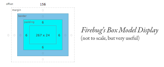
That model shows an HTML element with a width of 267px and a height of 24px. It has 6px of padding on every side, no border or margin, and it has top: 156px. You can actually see this box model for any HTML element by right-clicking the element and choosing inspect element!
You can put padding on specific sides of an element by using padding-right, padding-top, padding-left, and padding-bottom; same with margin. If the rule doesn't include a direction, like margin: 5px;, then it will apply 5px of margin to every side of the element.
Now that we've learned some useful CSS rules, we'll learn how to integrate a CSS file with our HTML!
How do I put CSS in my HTML file?
Just like HTML, you can write all of your CSS in one file, as long as you end the filename in .css. You can put the file in the same directory as your HTML files, or create a folder called “css” and put the file there. Then, in your HTML file, link to the CSS file in the head, using the following syntax:
<head>
    <title>How Website</title>
    <!-- The href for the CSS will be different depending on
        whether you put the CSS file in a new directory, which is
        what I've done here. -->
    <link rel="stylesheet" type="text/css" href="/css/style.css">
</head>
A consequence of this is that you can have one CSS file for multiple HTML files. Once again, that's how this website works! Here's another look at the directory structure, including the CSS:
jade/
  - css/
    - style.css
  - index.html
  - html.html
  - css.html
  - js.html
  - git.html
  - nextsteps.html
Each HTML file links to the same CSS file.
An important note is that I also use a font from Google Fonts. To use Google Fonts, you must import the font before importing the CSS file, like so:
<head>
    <title>Kylo Ren's Personal Blog</title>
    <link href='https://fonts.googleapis.com/css?family=Lato:400,700,900,400italic' rel='stylesheet' type='text/css'>
    <link rel="stylesheet" type="text/css" href="/css/style.css">
</head>
Wow, we covered a lot of content! Now let's learn some words.
CSS terms
- CSS
- Short for Cascading Style Sheets. Nobody knows that, though, so don't bother remembering it.
- rule
- A complete snippet of CSS: a selector and a property-value pair.
- selector
- A string that specifies HTML elements.
- class
- A special HTML attribute that makes it easy to select a group of elements with CSS.
- unit
- Most CSS values require units, like
pxor%. - line-height
- The vertical space taken up by each line of text in an HTML element.
- RGB
- A format for describing colors:
rgb(0, 0, 0). Each value can range from 0 to 255. - Hex values/hex codes
- A more compact color format:
#00FF00. Works the same way as RGB: the first two characters correspond to red, the next two correspond to blue, the last two correspond to green. Each pair of characters can range from00toFF. - Position
- A property that determines how an element's position is calculated. You should be familiar with the values
fixed,relative, andabsolute. - Padding
- Spacing between an element's content and its border.
- Margin
- Space outside of an element's border.
OK, let's goof around a little bit! I always find that when designing websites, and when using CSS in general, I get the best results when I try a lot of different things. So that's what we'll do now!
Explore the wonderful world of CSS
For this mini-project, we'll be reusing the HTML page we created at the end of the last lesson.
Getting started
Create a new folder called “css” inside the same folder that contains your HTML file, then create a new file inside “css”. You can call it style.css if you're boring like me.
In your HTML file, link to the new CSS file in the head, using the snippet from above. Add a simple rule to your CSS, like making all the text enormous, then save everything and refresh. If you can't see the change visually, be extra careful about your directory structure and make sure the file name is spelled right in the HTML (case-sensitive!).
Once everything is linked properly, let's get started!
Tasks
These are all open-ended, so exploration is encouraged! If you get bored with something, move onto the next thing. The only goal here is to try enough things that you end up with something good and unexpected.
- Use Google Fonts to try out a couple of different font options for your website.
- For each font, try a couple of different sizes and weights. Also, try different combinations of header font-size and text font-size.
- Once you have a couple of different options for fonts, try at least four different color schemes, including background colors. Here are some suggestions:
- Use 4 different colors on your site
- Use only 2. This is actually really hard!
- Try a dark theme
- Try using the color scheme of your favorite-designed website. BuzzFeed and Lyft are two great places to start.
- Try out at least 3 different layouts. You can follow these suggestions, or get creative!
- Try putting your links at the bottom of the page.
- Try putting everything in the middle of the page.
- Try filling the page with your image, using this guide.
Once you've finished trying everything, see if you can decide on two or three different themes for your site. Then, create a separate CSS file for each theme: that way, switching between themes on your HTML page will be as easy as changing the link snippet in the HTML!